Unravelling hypothesis testing with graphing technology

Hypothesis testing can be quite confusing for students; at A Level, the additional probability calculations involved make it more complex, and more understanding of the scenario is required.
We spoke to mathematician Simon May to understand how calculators and, in particular, new features on the fx-CG50 can help students improve their understanding when teaching this topic.
And it may also interest you that we provide free training for teachers to build confidence when using the fx-CG50 graphing calculator, showing how you can use calculators to reinforce teaching. We also have many resources available in our resource centre to support student revision and exam preparations.
Building the foundations with students
When introducing hypothesis testing, you’ll likely start with a straightforward binomial probability example like a coin toss. Only two things can happen here: you get heads or tails. In other words, you’ll introduce students to the concept of getting a success or a failure. Then, as you delve into the maths, you’ll explain that you would expect to get two and a half heads on average if you toss a coin five times.
But what if the coin is biased, and it’s not a 50-50 split between heads and tails? This scenario is, of course, where a hypothesis test comes into play.
Let’s take an example. Student A wins if a tossed coin shows heads, but Student B wins five consecutive games. Student A claims the coin must be biased because getting five out of five tails sounds unusual.
We assert that the null hypothesis is that the coin isn’t biased against heads. But then we investigate the alternative hypothesis: because they’ve got five tails in a row, perhaps the coin is biased, and the probability of getting heads is less than a half.
You can work the probabilities out through number crunching. But you can also use the new Distribution app on the fx-CG50, which is good for the Binomial distribution because the calculator draws the whole distribution.
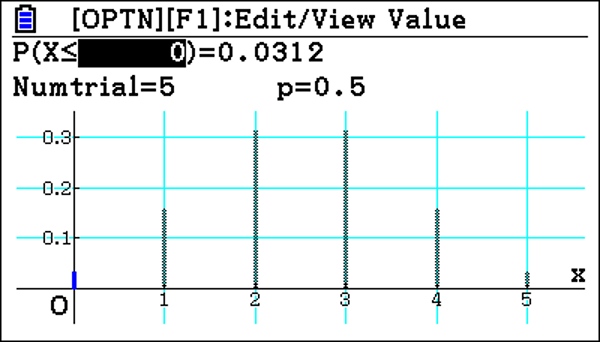
The value of the discrete random variable X, the number of heads tossed, can only be zero, one, two, three, four or five and the height of the bars on the graph represents the probability associated with obtaining just those values. We can see that the probability of getting zero (or less) heads is 3.12%. Suppose we are doing the test at a 5% significance level. The probability of tossing zero heads is below this, suggesting that the null hypothesis could be incorrect and that the coin is biased.
It’s a clear demonstration of how effectively the calculator approaches hypothesis tests by calculating the probability straight away.
Extending the learning further
If we then extend further, students will face other situations where they are doing and greater than probabilities.
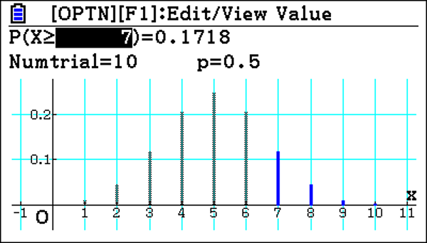
Let’s take a different scenario: the coin is tossed 10 times, and Student A wins 7 games. This suggests that there is an increased chance of tossing a head. To test this, you need to calculate the probability of scoring 7 or more heads.
If we go back to the calculator, you can input a greater than probability. You can do a manual calculation to get this value, but the distribution app does it immediately.
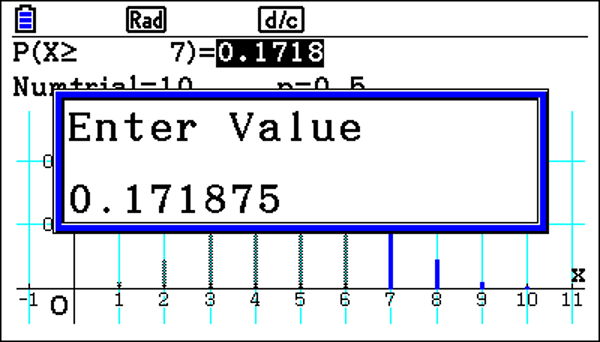
You can also highlight the probability; it gives a truncated value there. Most of the time, probabilities are only required to four decimal places. But because it is truncated, you would need the extra value if asked for three significant figures.
Once again, we have a picture of the whole distribution, from zero up to ten things that can happen. It highlights 7, 8, 9, 10 because it’s a greater than probability. And it works out to be 17.2%, again above the 5% significance level, so not that unusual.
When will the probability be smaller than the significance level?
Using the Distribution app it is very easy to change the values in the calculation and so find a value less than the significance level. This may not be the best approach for a large number of trials.
The other way of doing it, which is a nice feature, is to put the significance level 5% in straight away.
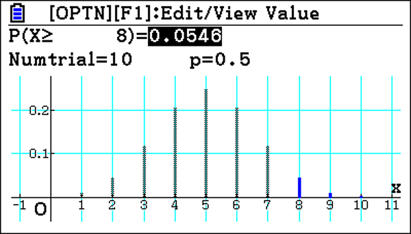
As this is a discreet distribution, the calculator shows the largest value of X, which is 8, which has at least the cumulative probability of 5%. The next largest value of X can then be substituted to confirm the Critical Value. It’s a nice feature because your students check it straight away.
Exploring normal distribution
Exploring normal distribution for hypothesis testing on the graphing calculator is very similar, with the same layout. If students input the values, the calculator nicely draws the distribution. But now you have a consistent display.
And similar to the binomial distribution, students could enter the significance level. But this time, because it’s a continuous distribution, it gives you the exact value of the critical value. You can scroll across and get its full values. It’s a fast way of getting the values that you need to determine the test outcome.
Hypothesis testing in normal is done on a sample, and it means an extra bit of maths is needed. Using the calculator, when students have to enter the standard deviation, they can enter a calculation in there, meaning they don’t have to work out a value for the calculation.
With this new app on the graphing calculator, it immediately draws the distribution for you and highlights the important sections. Doing the calculations quickly enables the students to better understand what they’re looking for in the question. And having that visual cue enables communication of multiple pieces of data simultaneously, so you can then get a full picture of the situation rather than trying to work through something step-by-step. Having the graph in front of you lets you see the value that has the highest or lowest probability.
The graphing calculator advantage
Using a graphing calculator makes life a lot easier for the students, and it takes away the necessity to do a lot of number crunching. Displaying the visual in front of them helps explain the point you’re trying to get across. Plus, you have a very useful facility at the top of the screen where you can change values almost instantly.
Previously, they would have to use some graphing software. Now students can do these calculations themselves with a calculator in their hands once the teacher shows them, making life easier for individual students.
It is also possible to do the calculations using Run Matrix. But students do need to know the syntax involved. Using Run Matrix gets the values; it saves students from having to do hard number crunching on a piece of paper. But it doesn’t get the point across as effectively as showing students the graph and the power of quickly changing a couple of values.
In hypothesis testing for A-level, it’s just binomial and normal distributions, But this extends in further maths, and the calculator can also help support learning and understanding here. The technology is a valuable teaching resource because students can use it individually, which allows them to achieve the desired result: understanding hypothesis testing.
Recommended

Probability: key challenges and how calculators can help
Read more
Ratio: why is it such a challenge and how can a calculator help?
Read more
Building calculator confidence for GCSE maths
Read more