Graphing technology accelerates learning in the classroom

Graphing technology accelerates learning in the classroom
When a projectile is thrown, its trajectory is typically modelled as only subject to a single unchanging force: gravity. A set of mathematical equations, commonly known as SUVAT equations, can be applied in this circumstance; what happens to the motion of a particle if the force used isn’t constant? You extend this principle when studying mechanics by investigating variable acceleration.
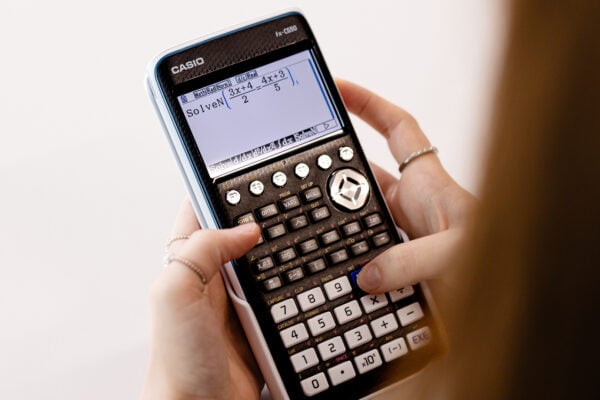
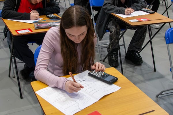
Students can struggle with understanding the motion of these particles and visualising what’s happening because it’s an arbitrary concept, and we are no longer dealing with particles thrown up in the air. A graphing calculator is very handy in these scenarios because it provides that visual learning aid. You may also be interested to know we provide free training for teachers to help build confidence using and teaching with the fx-CG50 graphing calculator. We also have a huge resources centre to support you with videos and guides that help with student revision and exam preparations.
How to understand variable acceleration better?
We spoke with mathematician Simon May to understand how graphing technology can help students understand variable acceleration better.
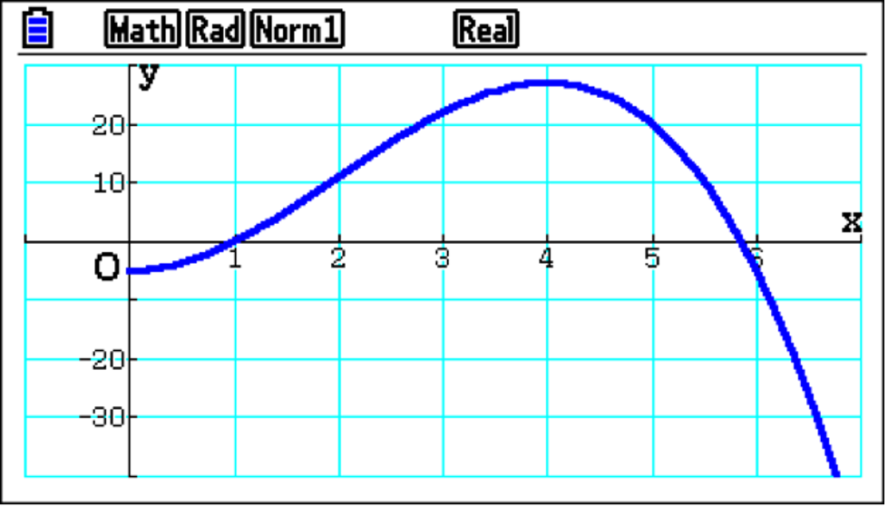
This subject is approached in the scheme of work using equations, more often than not expressed as polynomials in terms of t. In this case, the equation models the displacement of a particle with respect to time relative to a fixed point. Initially, you can see the graphed blue function is below the X-axis; it had negative displacement. Then, as time increases, you can follow that the position passes through the X-axis and becomes positive, reaches a maximum, and decreases to even more negative values.
Using graphing technology helps students understand particles in motion because they can visualise what is happening. If they’re doing it by writing something down on a piece of paper, it’s very hard to imagine what’s going on.
What you can also easily do is determine the velocity of the particle. Therefore, questions such as “After five seconds, how fast is it travelling?” can be asked and more clearly understood by students, with a clear link to differentiation being made.
Differentiation of the equation of motion provides, firstly, the velocity of the particle and then the acceleration, and the handset very nicely allows you to draw these derivatives.
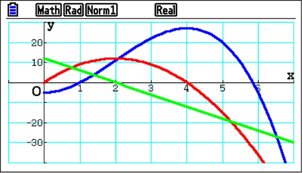
You end up with three graphs on the screen simultaneously, which is useful because this allows easy comparison between displacement, velocity and acceleration. For example, straight away from the graphs, you can see that as the particle reaches maximum displacement, it also has zero value on the red velocity graph.
Or, as the acceleration decreases and reaches zero, it has a maximum velocity with the red graph.
By analysing these graphs, students can develop a much clearer understanding of the relationships between the various functions and promote useful discussion when describing the particle’s motion.
How graphing technology helps student comprehension
Extending the application of calculus to particle motion, If you integrate the velocity function, you end up with the displacement function. As this includes an unknown constant, further information is often required to determine its value. However, if you integrate between two limits, you can determine how far the particle has travelled in a given time period.
When the integration is performed numerically, you may not realise that you could be integrating across the X-axis.
This is an important point to consider as two different values can be obtained by integration. And there is a subtle but crucial difference between these two values?
One is described as the total distance travelled, and the other is the displacement of the particle. Students need to understand the difference.
If integrated graphically, both values are obtained. This example provides a very nice opportunity for teachers to raise that point, saying: “What’s going on?”
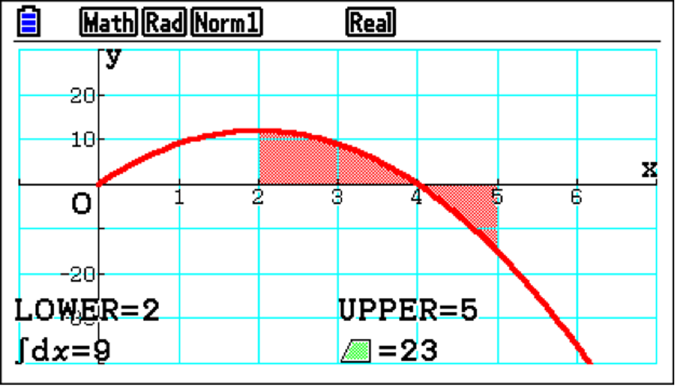
This allows students to become better at interpreting functions and their solutions.
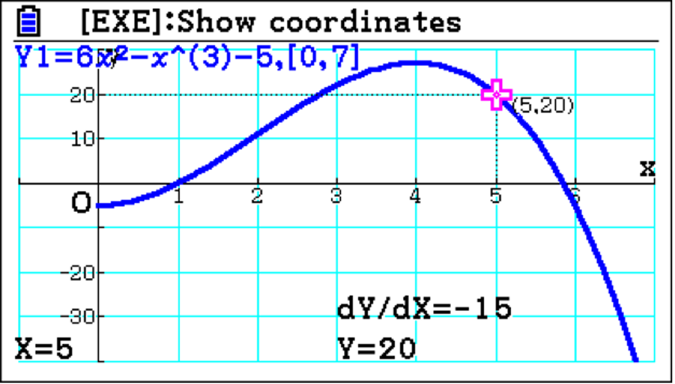
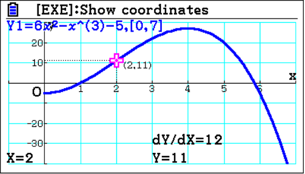
Additionally, analysis of the displacement can support students’ findings. By tracing a point, It makes sense that if you start at t=2, and end up at t=5, the difference in displacement value is 9.
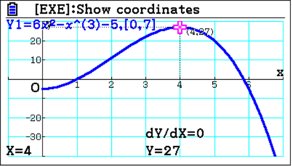
The graph shows that the displacement has a maximum before t= and so must have actually travelled further than the integral value 9. From t=2 to t=4, the distance travelled is 16; from t=4 to t=5, it is 7. Combining these values gives the total distance travelled of 23. Having the graphs and analysing them helps students improve their understanding of the fundamental difference between the distance travelled and the displacement.
Alternatives to graphing technology
Without graphic technology, teachers would have to try and draw the graphs on the board at the front. If you’re doing it by hand, an accurate representation of the relationships between the functions may not be easy to do.
You could also use graphing software, which is fine – except it’s not easy for students to follow along independently.
However, if you use an emulator in the classroom, it serves two purposes. First, it presents a clear display at the front of the room, and second, when students have the handsets in front of them, they can follow along simultaneously. If, for example, you ask, “What happens on the blue graph when t=2 ?” students can explore the problem independently.
As a learning experience, visual aids are much more engaging for students. Without them, it’s much harder for students to understand complex concepts. And for anyone who is less confident in teaching mechanics, having the visual aid to hand also supports with explaining complex concepts and building their confidence in the classroom.
How does graphing technology help learning
Variable acceleration is one of the topics that, if you presented in a dry fashion, students often quite like because essentially it boils down to differentiating functions and integrating functions – bread and butter for A-level pure maths.
However, if you want them to really understand what’s going on, you have to visualise it. As we explored in the integration, you will get the wrong value if you do a straightforward integration, and students can struggle with this particular topic if they don’t have a visual.
Whereas if you support learning with graphing technology, it’s clearer for students to see what is happening. They can see the part of the area is below the X-axis, which is a red flag to any mathematician to be careful.
Exam boards will try to uncover whether students do what’s predictable because they can do the mathematical operation or if they understand what is being asked of them. When students have the calculator handset, it makes it easier for them to work through questions because they will be better equipped to spot pitfalls, like where the function crosses the X-axis, and this experience will better prepare them for their exams.
Discover how you can use graphing technology and the fx-CG50 to improve your students’ understanding of maths.
Book your free online training session here.