Pie charts: How to calculate them, interpretation and more
How to calculate pie charts and analyse them in your learning
Secondary school maths students should be confident in their knowledge of how to calculate a pie graph and how to use the data they’re given to gain insights, draw conclusions and answer questions.
In this article, we’ll take a deep dive into pie charts, exploring what they are, how to calculate and create them, example questions and more.
What is a pie chart?
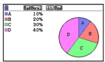
A pie chart is a type of graph presented in the shape of a circle, made up of distinct segments that show proportions within a data sample. The pie represents the whole data set, and the individual segments, or ‘slices’, are parts of the whole.
The sectors of a pie chart can be understood and analysed in terms of angles within the circle or as percentages, with the combined total of the segments always equalling 100%.
Pie charts are labelled and often coloured to give a clear visual representation of the data, with an accompanying key to show what each sector represents.
Pie charts are a familiar sight in secondary school maths lessons from year 7 onwards. They provide a visually engaging and accessible route into exploring data and statistics, while helping to reinforce your understanding of core mathematical principles such as:
- • Angles
- • Fractions
- • Percentages
- • Basic arithmetic
How to calculate a pie graph
One way to calculate a pie graph is to divide 360 by the total frequency in your data sample, then multiply this value by each category frequency to find the angle for each pie chart segment. The segment angles should add up to 360°.
To elaborate, here’s a simple example of the sort of scenario you might be presented with in a lesson or an exam question:
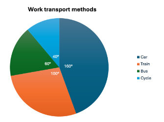
A group of employees were asked what methods of transport they used to get to work. Here are the results of the survey:
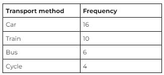
Using the above method, start by adding up the individual frequencies to calculate the total frequency. In this case: 16 + 10 + 6 + 4 = 36.
Then, divide 360 (the total number of degrees in the pie chart) by the total frequency. The resulting value will tell you the angle, in degrees, that each individual respondent to the survey equates to in terms of a pie chart.
In this case: 360 ÷ 36 = 10, so each person is equal to 10° in the pie chart.
Next, multiply each frequency by this angle value to get the angle for each segment of the pie chart.

The angles of each segment in your pie chart should always add up to a total of 360°. If they don’t, you know you’ve made a mistake somewhere.
When calculating the angle of each slice of a pie chart, a useful formula to remember is:

An alternative way to approach this and to present the formula for how to calculate a pie graph is:

How to calculate percentages on a pie chart
As well as being presented in terms of angles, the data you’re given to construct a pie chart can also be displayed as percentages.
If you’re provided with category frequencies and a total frequency, you can calculate percentages using this simple formula:

When you have an existing pie chart with the segment angles already calculated, you can convert this data into percentages with this formula:

Using the example above, it’s possible to calculate the percentage of respondents who travelled to work by car in either of the following ways:

You could come across some tricky calculations if you’re working with a range of values, fractions and percentages. It’s highly beneficial in these instances to have access to a reliable, GCSE-approved calculator that you can take into your exams.
How to draw a pie chart
The most important tools you’ll need when drawing a pie chart are a pair of compasses and a protractor.
To draw your chart, complete the following steps:
- Use your compasses to draw a circle
- Draw a vertical line from the centre point of your circle to the top of the circumference
- Position your protractor over the circle so the origin is at the centre point and the 0° line aligns with the vertical line from step two
- Use the protractor to measure out your first segment, ensuring it matches the segment angle values you’ve already calculated or been given, and mark the relevant position on the circle
- Remove the protractor and use a ruler to draw a straight line from the circle’s centre point, through the mark you’ve just made, to the circumference
- For the next segment, reposition your protractor to align 0° with the line you’ve just drawn
- Repeat steps four and five, taking care to measure the appropriate number of degrees for this segment before drawing your next line
- Repeat the process until you have added all segments
- Label each segment or create a key to show what each one represents
It’s important to note that the final segment in your pie chart will be the angle that remains once all previous segments have been added. Measure it with the protractor to ensure it matches the data you have for this slice of the pie chart. If the angle.
Common mistakes and misconceptions about pie graphs
Given the range of data you could be working with when calculating and drawing pie charts – category frequencies, total frequencies, angles and percentages, for example – it’s easy to make small mistakes that could produce incorrect results.
You should also be aware of scenarios where constructing pie graphs might not be an effective method.
- When calculating the angles of segments, having the category and total frequencies in the wrong place in the calculation will produce inaccurate answers.
- Mixing up angles and percentages can lead to confusion.
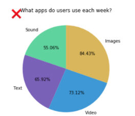
- Pie charts are intended to provide a parts-to-whole comparison, so shouldn’t be used when the data sample you have doesn’t make up a complete whole.
An example that illustrates the final point could be a survey in which individuals gave responses in multiple categories. This would create a pie chart with segments that add up to more than 100%, as shown below.
You could also find that constructing a pie chart isn’t the best option if you have a large amount of similar data points. This will produce a lot of slices with little variation in size, making it difficult to compare and differentiate between them.
Pie chart GCSE questions
Here are some examples of the sorts of questions you might come across when studying pie charts:
- Using the data below, calculate the size of the angle for the segment ‘Blue’
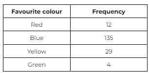
Answer: 270°
- This pie chart shows the results of a survey in which 320 people were asked to choose their favourite type of film from four categories. How many people said they preferred sci-fi?
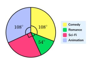
Answer: 80
- This pie chart shows the different types of pizzas ordered in a restaurant on one day. If 260 pizzas were ordered, how many were pepperoni?
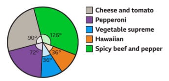
Answer: 52
Working example of a pie chart
Below are some more examples of how pie charts could be used for data reporting and analysis.
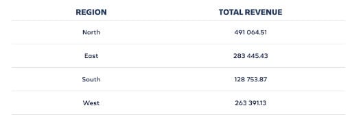
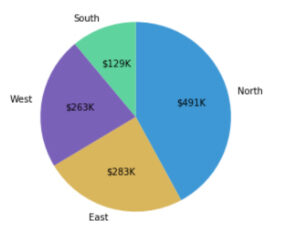
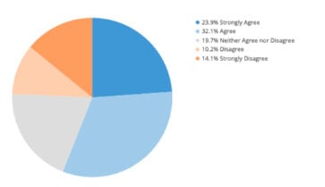
As you progress through your secondary school maths education and embark on deeper explorations of data, statistics and how they can be represented graphically, you’ll have more to gain from the extensive functionality of scientific and graphic calculators.
Take a look at Casio’s range of approved calculators for GCSE and A-level maths.
Blog
- Curriculum
- Graphing technology
- Scientific calculators
- Exams
- Classroom
- Students


